“From style guides for Coca-cola, book design in the 16th century, or the hand written origins of some of the world’s most famed fonts, the Archive collects, preserves, and tells the story of the importance and fascination with letters” —Juxtapoz
I found out about the Letterform Archive during my flight back from Europe to San Francisco, an extremely long, uncomfortable trip that I spent thinking about all the exciting things I had left behind on a hand, and about all the exciting projects to achieve in my “new home” on the other.
San Francisco is plenty of places to discover, experiences to live, special people to get to know. Amongst these pearls, the Letterform Archive was calling me. I read about it in the British Airways’ magazine and I immediately noted down name, address and website —”The largest private collection of letters art in the USA”. The description didn’t cheat.
The Letterform Archive was founded by Rob Saunders, a graphic designer, teacher and publisher who collected admirable products lettering art for over 40 years, finally establishing the Archive (of which he’s currently the curator) in 2015. Saunders says in the interview for eyeondesign, “Periodicals are such a great snapshot in time, they’re extraordinary examples of design and production”. Indeed the collection of over 40.000 items is curated with a design-centric approach aiming to encourage browsing, discovery, and to be visually pleasant and easy to access.
This approach was very clear in their (free!) guided tour. A large table in the center of the spacious main room displaying many different open books, neatly arranged with a narrative line, welcomes the visitor.
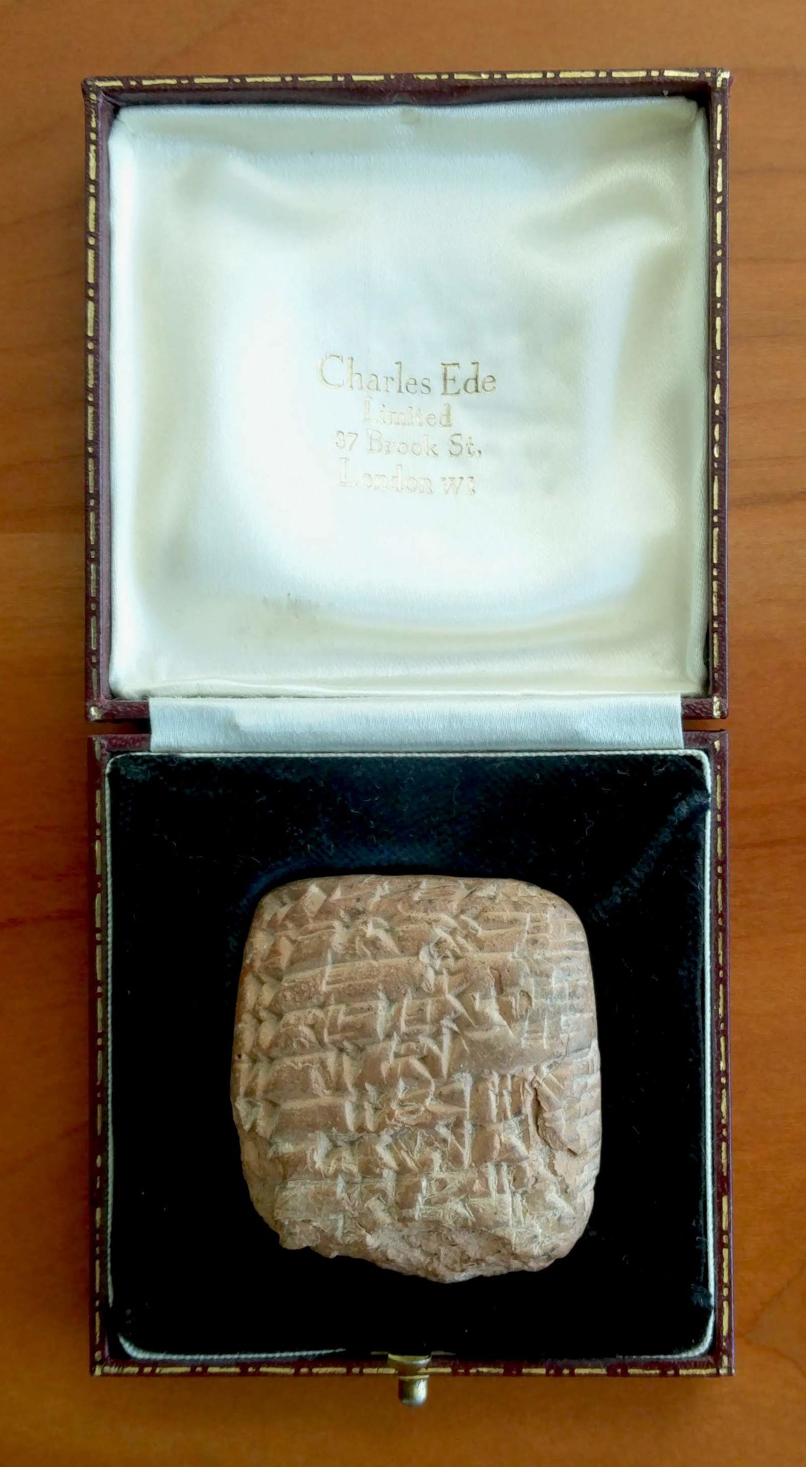
The tour develops around the table. Stephen Cole, Associate Curator and Editorial Director of the Letterform Archive, shows us the most antique example of writing part of the Archive’s collection: a sale’s receipt from Middle East dated 2000 years ago. The first examples of writing in history (even before religion) are related to finance, as the guide explains us.
In fact, the second document picked by Cole is a bible; precisely two examples of biblical texts: the first one is a 1400’s manuscript, then we see one of the first bibles printed by Gutenberg in 1450. The difference isn’t immediately visible, and Cole helps us to notice the well-done handwriting effects made by Gutenberg’s printing press. The types of Gutenbergs’ printing presses were slightly different one from another (for example, you could find many t in one page that were not identical as they are in modern printing). This is in order to recreate the quality of “uniqueness” belonging to manuscript documents.
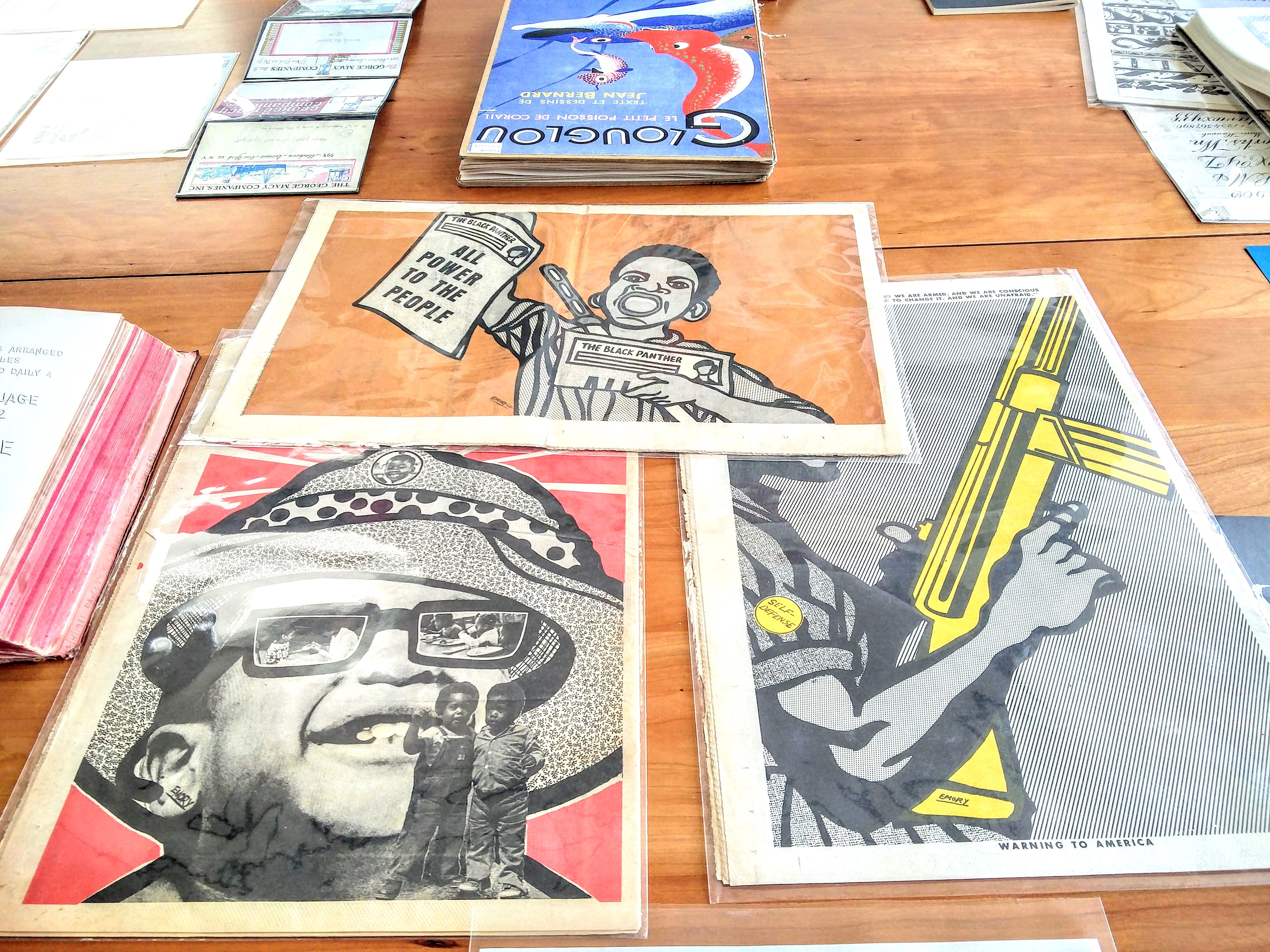
Together with observation, comes the explanation of the processes and technologies used to create each document. Regarding the Phototype machine used to print the Black Panthers’ magazines and posters, Cole tells us: “the necessity of material defines the formal outcome”. This is as true as it is for painting. We can think about Picasso’s Blue Period, not only born from the personal life-phase of the artist (sadness, depression, melancholy) but also from the good deal the painter got in buying blue paint in bulk. Artists start from the medium, therefore artworks and media are extremely connected on both the physical and the conceptual level.
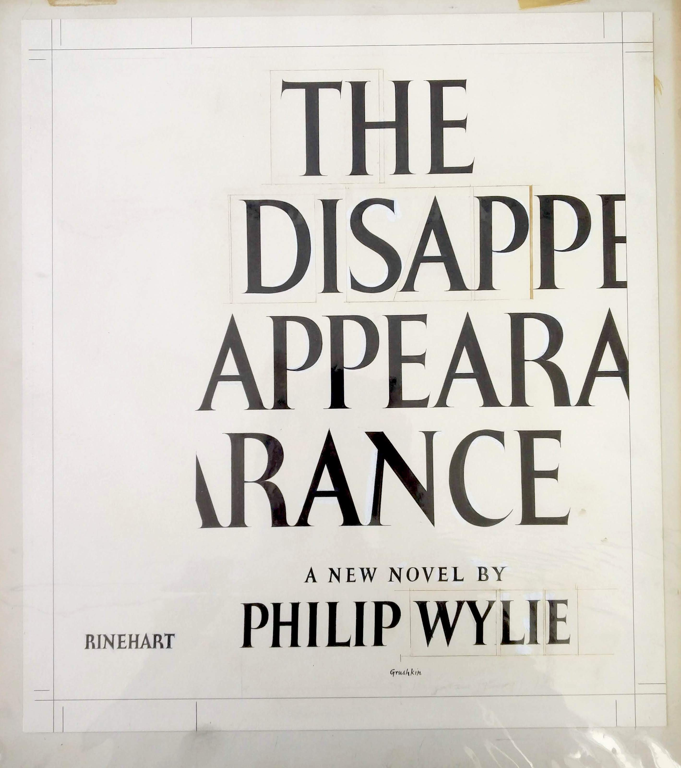
The tour concludes with more artistically experimenting products, such as the works of Romano Hänni, Philip Grushkin, Eduardo Pauluzzi.
The Letterform Archive gathers valuable works of lettering, typography, calligraphy and graphic design; it boasts items coming from all around the world. In fact, one of the last acquisitions consists in the Jan Tholenaar Collection from Amsterdam, “one of the top five collections of its kind in the world” Cole states. This collection alone possesses 8,000 international foundry and printer type specimens, spanning from 1500 to the second half of 20th century.
The Art of Lettering links graphics with design, it expands the meaning of words through visual perception. Beside being a primary tool for communication, language reveals the way reality is organized and, viceversa, the way we organize reality. Indeed the words we use indicate much of ourselves —how we think, what we feel, what’s relevant to us and so on. At the same time, the lexicon we use to communicate shapes our mentality and our intellectual functions. Lera Boroditsky, cognitive scientist and one of the main contributors to the Theory of Linguistic Relativity, explains this concept at TED.
The vital importance of mastering a language and all its parts (words, grammar, pronunciation, accents) is very clear to who speaks multiple languages. The intrinsic value of language is what really grasped my interest when I moved to San Francisco from Italy. Although I was already speaking English, the gap between me and the rest of the people on the communicational level was extremely tangible. This is how and why I realized Funny Words, a series of surrealistic images playing with English pronunciation and words’ meaning.
The Letterform Archive celebrates the power of written language preserving precious documents, and it shows the birth and and the development of the Art of Lettering. The non profit art center represents a valuable example of human necessity of preserving language, and to express its potentiality through innovative ways throughout history.